
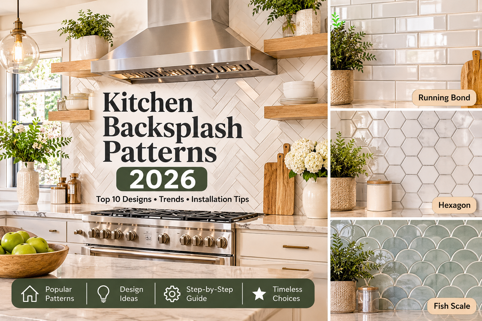
Your kitchen backsplash does more than just protect the wall from spaghetti sauce splatters. The pattern you choose dictates the entire room’s vibe. The exact same tile can feel quiet and traditional in a running bond layout, sharp and modern in a straight stack, or lively and decorative in a herringbone. That is exactly why the layout matters just as much as the tile material itself.
If you are looking for a quick answer: running bond (the classic brick layout) and straight stack are your safest, most flexible bets. Herringbone adds beautiful movement without requiring bold colors. Meanwhile, hexagon, fish scale, and basketweave work best when the rest of the kitchen is calm enough to let them truly shine.
This guide breaks down ten proven layouts, how they compare, what is actually trending in 2026, how to design your own, and a practical walkthrough for installing a herringbone backsplash.
What Are the Most Popular Kitchen Backsplash Patterns?
There is no official national ranking for backsplash layouts. When people talk about “the most popular,” they are really talking about what top designers and major tile retailers feature most often. By that measure, subway tile in a running bond, straight stack, herringbone, and hexagon layouts show up repeatedly.
Before diving in, let’s separate two terms. Tile shape (or format) describes the physical piece itself (like a 3×6 inch rectangle or a hexagon). Layout (or pattern) describes how those pieces are arranged on the wall. One simple rectangular tile can be installed in four or five different ways, and that choice changes the final look far more than most homeowners expect.
1. Herringbone
Herringbone uses rectangular tiles joined end-to-side at right angles. Each tile forms an “L” with its neighbor, making the rows read as a broken zigzag. It is traditionally installed with the zigzag running at 45 degrees to the wall edges, but laying it vertically or horizontally gives a more upright or stretched, modern look.
- Common tiles: 2×6, 2×8, 3×6, and 3×12 inch rectangles. Many brands also sell herringbone mosaics pre-mounted on mesh sheets, which drastically simplifies installation.
- Best with: Transitional, traditional, and modern farmhouse kitchens. Marble-look and glossy white versions also suit contemporary spaces beautifully.
- Visual effect: Adds instant texture and movement. Small herringbone reads as fine, intricate detail; larger tiles read as bold and graphic.
- Pros: Looks highly custom even in a neutral color, pairs well with plain cabinets, and stays interesting without needing loud colors.
- Cons: Requires more cuts at the edges, generates more waste, and is less forgiving of crooked layout lines than a straight grid.
- Grout tip: Matching or close-to-tile grout keeps the pattern soft and elegant. Contrasting grout highlights every single joint, making the design much louder and busier.
2. Subway Tile and Running Bond
Subway tile is a format, not a pattern. The classic size is nominally 3×6 inches, though many manufacturers now sell slimmer or longer versions. Running bond is the installation pattern most often paired with it: each row is offset from the one below, usually by half a tile, mimicking classic brickwork.
When someone casually says “subway tile backsplash,” they almost always mean running bond. However, subway tile can also be stacked straight, set vertically, or arranged in herringbone.
- Best with: Almost any style. It is the most adaptable layout on this list.
- Visual effect: Calm, familiar, and horizontal, which naturally tends to make a wall feel wider.
- Pros: Fewer cuts, low waste, simple to install, and incredibly easy to pair with other design choices.
- Cons: Can feel a bit plain if the tile, color, and finish are all too basic.
- Modern take: Try longer, slimmer tiles in a soft color with a handmade-look surface, or use a one-third offset instead of a half-offset for a less predictable, more organic rhythm.
3. Straight Stack (Stacked Bond)
In a straight stack, tiles line up in both directions with zero offset, so the joints form a clean, continuous grid. It reads as minimal, orderly, and highly contemporary.
- Horizontal stack: Rectangular tiles laid with the long side across. This looks wide and calm.
- Vertical stack: Rectangular tiles stood upright. This draws the eye upward and can make low ceilings or short walls feel noticeably taller.
- Best with: Modern and minimalist kitchens, especially those with slab-front or flat-panel cabinets.
- Watch for: Grid layouts show every single misaligned joint. Level and square layout lines are absolutely critical here. Walls and tiles that are slightly out of square are far less forgiving in a stack than in a running bond.
4. Chevron
Chevron looks similar to herringbone at a quick glance, but the construction is entirely different. Chevron tiles have angled ends (commonly cut at 45 or 60 degrees) so they meet to form continuous, unbroken V-shaped lines with no stepped edges. Herringbone, by contrast, uses plain rectangles whose square ends butt into the sides of neighboring tiles.
Because of those angled ends, chevron generally requires pre-cut chevron tiles or precise mitered cuts, making installation more demanding. The result is sleeker and more continuous than herringbone. It suits modern and glam kitchens, whereas herringbone feels a bit more classic and rustic.
5. Basketweave
Basketweave pairs rectangular tiles in small groups, alternating the groups between horizontal and vertical orientation so the surface looks woven. Traditionally, it is made from two or three rectangles per square block, sometimes featuring small square inserts known as “dots” at the intersections.
- Best with: Traditional, cottage, and vintage-inspired kitchens.
- Design tip: Because the pattern is already highly detailed, skip contrasting grout and keep the cabinetry simple. It is widely available as mosaic sheets, making it much more practical for a backsplash than building it one tile at a time.
6. Diagonal (Diamond) Layout
A diagonal layout rotates square or rectangular tiles 45 degrees so they sit on their points like diamonds. It brings immediate movement to a plain tile and can make a small wall feel much more dynamic.
- The tradeoff: Cutting. Every edge, corner, and electrical outlet requires angled cuts, so waste is higher and layout planning matters immensely. Allow around 15% overage, and strongly consider a professional installer for natural stone or glass. Keep colors and tiles simple; the angle is the decoration.
7. Hexagon
Hexagon tile forms a honeycomb that has no straight horizontal joints, giving a geometric look that suits both modern and retro kitchens.
- Scale matters: Small hexagons (about 1 to 2 inches) read as a rich mosaic texture; large hexagons (4 to 8 inches) read as a bold, graphic statement.
- Grout tip: Contrasting grout accentuates the geometry, while matching grout softens it. Note that hexagon edges meet the countertop and cabinets with a scalloped outline unless cut or finished with specific edge pieces. Always check how the first and last rows will look before you buy.
8. Fish Scale (Scallop)
Fish scale tiles have a rounded or pointed lower edge. When set in overlapping rows, they create a beautiful fan or scallop effect. They suit coastal, vintage, Mediterranean, and glam kitchens, and look especially stunning in glossy glazed finishes or soft, muted colors.
- The risk: Visual overload. Keep the rest of the kitchen quiet, use one or two closely related colors, and avoid pairing fish scale with a busy countertop. Layout directions differ by product, so always follow the manufacturer’s specific layout guide.
9. Vertical and Horizontal Orientation
The exact same rectangular tile gives completely different effects depending on how it sits. Horizontal tile makes a wall feel wider. Vertical tile adds perceived height and suits kitchens with a low upper cabinet line or a narrow wall. Combine orientation with offset or stack to get four easy variations from one tile: horizontal running bond, vertical running bond, horizontal stack, and vertical stack.
10. Geometric and Mixed Patterns
Geometric layouts combine shapes or sizes, such as hexagons with small inserts, arabesque shapes, or a field of plain tile with an inset panel of pattern tile behind the range. A common, highly effective approach is to use plain tile across the wall and place a patterned panel where attention is already drawn (like behind the stove), then frame it with a simple border. Keep it to one patterned area. Mixing too many unrelated pattern types is the quickest way to make a kitchen look cluttered.
Quick Comparison of Popular Backsplash Patterns
| Pattern | Appearance | Best Kitchen Style | Visual Effect | Installation Complexity |
|---|---|---|---|---|
| Herringbone | Broken zigzag from rectangles at right angles | Transitional, traditional, farmhouse, contemporary | Texture and movement | Moderate to high |
| Running Bond | Offset rows like brickwork | Nearly any style | Calm, wider look | Low |
| Straight Stack | Clean grid, no offset | Modern, minimalist | Orderly; vertical adds height | Low to moderate (alignment is critical) |
| Chevron | Continuous V lines from angled tile ends | Modern, glam, contemporary | Sleek and directional | High |
| Basketweave | Woven look from alternating blocks | Traditional, cottage, vintage | Detailed, classic | Moderate (often mosaic sheets) |
| Diagonal | Tiles set on point like diamonds | Transitional, eclectic | Movement from a plain tile | Moderate to high (many angled cuts) |
| Hexagon | Honeycomb | Modern, retro, industrial | Geometric texture | Moderate |
| Fish Scale | Overlapping scallops | Coastal, vintage, Mediterranean, glam | Decorative, soft | Moderate to high |
| Vertical/Horizontal Stack | Upright or flat rectangles | Modern, narrow or low-ceiling kitchens | Adds height or width | Low to moderate |
| Geometric/Mixed | Combined shapes or sizes | Eclectic, statement kitchens | Focal point | Varies, often high |
Herringbone vs. Chevron vs. Running Bond
These three get confused more than any others, so here is the plain, simple version:
- Herringbone: Rectangular tiles meet at right angles, and the pattern has a stepped, broken zigzag.
- Chevron: Tiles have angled ends that meet to form unbroken, continuous V shapes.
- Running Bond: Tiles sit in straight rows, each offset from the one below.
| Feature | Herringbone | Chevron | Running Bond |
|---|---|---|---|
| Tile arrangement | Rectangles joined end to side at right angles | Angled-end tiles joined point to point | Straight rows with an offset, typically half a tile |
| Appearance | Broken, textured zigzag | Continuous, sleek V lines | Brick-like, calm horizontal lines |
| Cutting requirement | Straight edge cuts at borders and corners | Angled cuts or pre-cut chevron tiles | Few cuts, mostly at wall ends |
| Waste | Higher than running bond | Often highest of the three | Lowest of the three |
| Design applications | Classic and contemporary, versatile | Modern, glam, bold | Universal, transitional to traditional |
Note on waste: When a retailer or installer lists numbers for pattern waste, treat them as rough estimates. Waste varies with tile size, wall shape, and installer experience. Many pros add around 10% for straight layouts and 15% to 20% for herringbone, chevron, or diagonal layouts. Your product’s manufacturer or installer will give you the most accurate number.
Modern Kitchen Backsplash Ideas and 2026 Trends
Trend coverage for 2026 comes mainly from design publications, tile retailers, and designer commentary, rather than independent consumer surveys. That is worth keeping in mind: it tells you what designers are actively featuring and what retailers are promoting, not an exact national popularity ranking. Several themes show up consistently across that coverage:
- Stone slabs and large-format surfaces: Veined stone slabs, sometimes carried up the wall as a taller “countersplash” or full-height wall surface, appear near the top of several 2026 trend lists. Fewer grout lines mean easier cleaning and a more integrated, seamless look.
- Handmade-look and decorative tiles: Zellige-style tiles and hand-painted or artisan-looking tile are being featured heavily for their uneven, light-catching surfaces.
- Warm neutrals and earthy colors: Cream, warm white, taupe, and clay tones are gaining serious attention over cool gray, along with deeper greens and moody shades for kitchens with a stronger color story.
- Texture and curves: Ribbed, rippled, or sculptural tiles and curved shapes (including scallops) are featured as clever ways to add interest without relying on bold color.
- Mixed materials: Combinations such as stone with metal, wood, or glass appear in several trend lists.
- Quieter, more integrated kitchens: At least one major designer note in recent coverage points out that clients are leaning toward calmer, more integrated backsplashes. Some designers say high-contrast looks, like black grout on white subway tile, are starting to feel dated.
These are editorial observations, so use them as inspiration, not strict rules. Trends vary by region, budget, and house style. A backsplash is costly to replace, so it is usually wiser to choose a timeless tile and use a trend in a cheaper, easier-to-change place, such as paint, hardware, or accessories.
Are Patterned Backsplashes in Style?
Yes, but with restraint. Patterned layouts such as herringbone, fish scale, and hexagon continue to appear in design coverage, usually in muted colors with tone-on-tone grout. What designers describe as “dated” is usually the high-contrast, overly busy version, not the pattern itself.
Backsplash Trends to Avoid
Based on current designer commentary, these are the looks most often described as aging quickly:
- High-contrast grout lines on plain subway tile.
- Very busy mosaics competing with patterned countertops.
- Highly glossy, single-trend colors that clash with the rest of the kitchen.
- Heavy faux finishes that do not match the room’s actual materials.
This is opinion, not a hard rule. If you love one of these and your kitchen supports it, it can still work beautifully.
Timeless vs. Trend-Driven Choices
| Design Element | Timeless Options | Trend-Driven Options | Selection Advice |
|---|---|---|---|
| Color | White, warm white, cream, soft gray, natural stone tones | Sage or deep green, charcoal, clay, bold blue | Choose timeless for the tile, trend color for paint or accessories. |
| Layout | Running bond, straight stack, simple herringbone | Large hexagon, fish scale, mixed patterns | One pattern, one focal point. |
| Material | Ceramic, porcelain, natural stone | Slab, zellige, textured or curved tile | Check maintenance before falling for the look. |
| Finish | Gloss or matte neutral | Handmade-look or heavily textured surfaces | Test samples in your actual kitchen light. |
| Grout | Matching or close tone | Deliberate contrast | Contrast makes every layout flaw visible. |
How to Choose a Kitchen Backsplash Pattern
Start with what is already in the room, because the backsplash sits directly between your two largest finishes: cabinets and countertops.
- Busy countertop (veined stone, speckled quartz): Choose a quiet backsplash. Running bond or straight stack in a plain color is your best friend. Patterned tile plus a patterned counter is the most common reason kitchens look cluttered.
- Plain countertop (solid quartz, butcher block, simple laminate): This is exactly where a herringbone, hexagon, or fish scale layout works best.
- White cabinets: Almost anything works. Choose by mood: warm white and cream for softness, green or blue for a pop of color, marble-look for polish.
- Wood cabinets: Warm whites, creams, and muted greens balance the wood beautifully. Avoid orange-toned tile against orange-toned wood.
- Dark cabinets: Light tile in a textured or patterned layout brings necessary contrast, and a glossy surface bounces light back into the room.
- Small kitchens: Large-format tile means fewer joints and a calmer look. Light colors and matching grout reduce visual clutter. A vertical stack adds perceived height.
Grout Color Changes Everything
Grout is not just a filler. Matching or near-matching grout blends the joints and shows the tile shape, which makes complicated patterns feel softer and more unified. Contrasting grout draws the pattern like a diagram, which is bold but also reveals any layout flaws. Very light grout in a cooking area can stain, so consider a stain-resistant formulation, and always follow the tile manufacturer’s guidance for grout type and joint width.
Backsplash Colors That Stay Timeless
White, warm white, cream, beige, soft gray, and natural stone tones tend to stay versatile across decades because they do not lock the kitchen into one specific era. No color is universally best, though. A timeless color still needs to suit your cabinets, countertop undertone, and light. Always compare samples by daylight and evening lighting, because the exact same white can look blue, yellow, or gray depending on the bulb.
Backsplash Tile Materials Compared
| Material | Appearance | Main Advantages | Maintenance Considerations | Typical Applications |
|---|---|---|---|---|
| Ceramic | Wide range of colors, glazes, and sizes | Affordable, easy to find, easy to cut | Glazed surfaces wipe clean; grout needs periodic cleaning | Most kitchen backsplashes, especially budget projects |
| Porcelain | Dense tile, often stone-look or matte | Durable, low water absorption, hard-wearing | Harder to cut than ceramic; grout care as above | Large-format, stone-look, high-traffic kitchens |
| Natural Stone (marble, travertine) | Natural veining and variation | Distinctive, high-end look | Porous; usually needs sealing and care with acidic cleaners | Statement and traditional kitchens |
| Glass | Glossy, reflective, color-rich | Bright, easy to clean surface | Can show water spots; needs correct adhesive and non-scratching grout | Small mosaics, accent areas, modern kitchens |
| Zellige-style / Handmade | Uneven, glossy, hand-finished | Depth and character | Irregular surface and joints; installation and grout need care | Warm, artisan, transitional kitchens |
Note: Because performance varies by product, rely on the manufacturer’s technical specifications for water absorption, sealing, and cleaning products. Natural stone, in particular, varies widely from one quarry to another.
How to Design a Backsplash Pattern for Your Kitchen
Use this sequence to move from idea to decision without regrets:
- Define the kitchen style: Traditional, transitional, or modern determines how much pattern the room can carry.
- List what is fixed: Cabinet color, countertop pattern, flooring, and appliance finish all stay, so the backsplash must work around them.
- Decide: blend or contrast: A blended backsplash (close in tone to the counter or walls) is calm. A contrasting one becomes the focal point. Pick one, not both.
- Choose a tile shape: Rectangles open up running bond, stack, herringbone, and chevron. Hexagons and fish scale have fewer layout options. Consider scale: small tiles on a large wall can look busy, and large tiles on a small wall can look blocky.
- Choose the layout: Match the pattern to how much visual energy the room can absorb.
- Choose grout: Decide matching or contrasting before you finalize the tile.
- Measure: Backsplash area is length times height. A typical gap between a standard counter and upper cabinets is about 18 inches, though yours may differ. Example: Two walls of 10 feet and 6 feet at 18 inches (1.5 feet) high is 16 x 1.5 = 24 square feet. Subtract a 4 square foot window area, and the net is 20 square feet. With about 15% overage for herringbone, order about 23 square feet (20 x 1.15). With 10% for running bond, order about 22 square feet (20 x 1.10). Round up to whole boxes.
- Plan the details: Mark outlets, switches, the range hood zone, window returns, and where the tile ends at open edges. Decide whether tile stops at the underside of the cabinets or runs up the entire wall.
- Get samples and test them: View them on the wall at different times of day and under your own light bulbs.
- Keep to one pattern: One layout plus one color story reads as intentional and professional.
Herringbone Kitchen Backsplash: Design and Installation
Herringbone is the pattern readers search for most in this topic cluster, so it deserves a full walkthrough.
Design Tips
- Tile size sets the tone: Small herringbone tiles look fine and textured; larger tiles read bold and modern.
- Direction matters: A vertical herringbone draws the eye up; a horizontal one stretches the wall. The 45-degree diagonal version is the most traditional.
- Keep color quiet: The pattern already provides plenty of interest.
- Plan the center: Center the pattern on the most visible point, often the range, so it looks balanced on both sides.
How to Install a Kitchen Backsplash in a Herringbone Pattern
The following is a general overview, not a replacement for the manufacturer’s instructions. Adhesive, grout, waterproofing, curing time, and sealing requirements all depend on the tile and the installation system. For the industry reference, see the TCNA Handbook and the instructions for your specific products. Complex layouts, damaged walls, natural stone, and difficult cuts are good reasons to hire a professional tile installer.
- Prepare the wall: Remove outlet covers, clean away grease and dust, and make sure the surface is sound, flat, and suitable for tile. Repair loose or damaged drywall, and use any primer or waterproofing the product requires.
- Measure and mark a centerline: Find the center of the focal point (usually the range) and mark a plumb line up the wall. Add a level horizontal line at a fixed height above the counter.
- Dry lay the pattern: Lay tile on the counter or a flat surface to see how the pattern runs and where cuts will fall. This is exactly where you spot ugly slivers before they are glued down.
- Choose a starting point: Many installers start from the center and work outward so cuts are balanced at both ends. For a 45-degree herringbone, snap a guide line or use a ledger board so the first tiles are exactly aligned.
- Spread adhesive: Use the type and notched trowel size the tile maker recommends, working in small sections you can tile before the adhesive skins over.
- Set the tiles: Place each tile at a right angle to its neighbor, press it in, and check alignment often. Use spacers sized to your planned joint. Herringbone mosaic sheets on mesh follow the same planning steps but go up much faster.
- Cut border and edge tiles: A wet saw or a tile cutter suited to the material gives cleaner results. Plan the cuts at outlets, corners, and open edges in advance, and cut after you have dry-fit.
- Let the adhesive cure: Follow the adhesive manufacturer’s time before grouting.
- Grout and clean: Use grout suitable for the tile and joint width, work it into the joints, then wipe the surface at the manufacturer’s recommended timing.
- Seal if required: Natural stone and some grouts may require sealing, and the manufacturer will specify when.
Why Herringbone Is Less Forgiving
One crooked tile can throw the pattern off across the whole wall. Joints that vary from tile to tile become obvious because the zigzag makes the eye follow the lines. A dry layout, consistent spacers, and frequent level and plumb checks are your best protection.
Rectangular and Fish Scale Kitchen Backsplash Patterns
The search “how to do kitchen backsplash tile rectangle fishscale patterns” actually combines two quite different layout problems.
Rectangular Tile Layouts
One rectangular tile supports several layouts:
- Running bond: Offset rows; the easiest to install and the most forgiving.
- Straight stack: No offset; clean and modern, but unforgiving of misalignment.
- Vertical stack or vertical running bond: The same tile stood upright for added height.
- Herringbone: Right-angle zigzag; more cuts and more waste.
- Chevron: Only possible with angled-end tiles or accurate miter cuts.
Fish Scale Tile Layouts
Fish scale (scallop) tiles are uniquely shaped, so the layout is dictated more by the tile than by you. They are typically installed in staggered rows where each scallop sits between the two below it, creating overlapping fans. Do not assume all products are laid the same way. Some are made to point down, some can be turned to point up or sideways, and some are sold as sheets with fixed spacing.
To get it right, order a sample, dry-lay a small area, and check the manufacturer’s layout guide or installation instructions. Pay close attention to how the pattern finishes at the top, at the countertop, and around outlets, and decide whether it ends with a full scallop or a cut one. Using a single color, or two close tones, keeps the pattern from becoming too busy.
Budget-Friendly Kitchen Backsplash Ideas
Good kitchen backsplash ideas on a budget generally come from smart layout and material decisions, not from buying lower quality products.
- Pick standard ceramic: Plain ceramic subway tile is commonly one of the lowest-cost tile options available.
- Choose a simple layout: Running bond or straight stack reduces cuts, waste, and labor time.
- Use accents sparingly: A small patterned panel behind the range, with plain tile elsewhere, gives the feel of a high-end feature for much less tile.
- Choose standard sizes: Common sizes avoid special-order delays and extra costs.
- DIY the simple parts: A straight layout is the most beginner-friendly, while complex patterns are exactly where a pro earns their fee.
- Compare total cost: Material price per square foot is not the full cost. Add adhesive, grout, trim, tools, and labor. Prices change and vary by region, so get current local quotes and keep material and labor separate.
Peel-and-Stick Backsplash: Pros and Limits
Peel-and-stick backsplash tiles (often searched as “backsplash for kitchen stick on”) are the lowest-effort option and suit renters and quick updates perfectly.
Advantages: No grout or mortar, quick installation, lower upfront cost, and many are removable.
Limits to check:
- Surface preparation: The wall must be clean, dry, smooth, and free of grease. Textured or damp walls cause poor adhesion.
- Heat: Many vinyl-type products soften with heat. Do not assume a peel-and-stick product is safe directly behind a stove. Look for a stated heat rating and the required distance from the cooking surface in the product’s data sheet. Products specify different distances (one product covered in 2026 review coverage recommended at least about 16 inches above the stovetop, for example), so use the figure from your specific product and your range’s manual.
- Moisture: Edges near the sink may lift if water gets behind them.
- Cleaning: Check which cleaners the manufacturer allows.
- Compatibility: Some adhesives can damage paint or wallpaper on removal.
A common, smart compromise is using real tile or stainless steel in the direct cooking zone and peel-and-stick elsewhere, but only if the product’s own instructions allow it.
Backsplash Design Mistakes to Avoid
- Fighting the countertop: Strong veining on both surfaces competes for attention.
- Mixing too many patterns: One focal pattern is plenty.
- Ignoring grout: Grout color completely changes the pattern’s visual weight.
- Skipping samples: Tile looks drastically different in your kitchen than in a brightly lit showroom.
- Ignoring lighting: Under-cabinet lights amplify texture and gloss.
- Weak layout planning: Awkward, sliver cuts at the end of a wall are very visible.
- Overlooking edges and corners: Plan outlet covers, window returns, and where the tile stops.
- Using the wrong product for the spot: Always check heat, moisture, and cleaning rules for the specific location.
How to Make a Kitchen Look Classy and Expensive with the Right Backsplash
No single color or pattern magically makes a kitchen look expensive. What designers consistently point to are fundamentals: coordinated materials, a limited palette, one clear focal point, straight and consistent grout lines, clean cuts at edges and outlets, and quality finishes. A simple white or warm neutral tile installed with absolute precision usually looks more refined than a complicated pattern installed carelessly.
By the same logic, a kitchen tends to look cheap when elements clash, patterns compete, lines are crooked, or finishes do not match. Keep the palette tight and the installation tidy, and it will read as intentional and high-end.
Frequently Asked Questions
What style of backsplash is best for a kitchen?
There is no single best style. Running bond subway tile and straight stack are the most flexible. Choose based on your cabinets, countertop, and how much pattern the room can naturally carry.
What is the rule of thumb for a backsplash?
A common design guideline is to keep one focal point, let the backsplash either blend with or deliberately contrast the countertop, and run it from the counter to the underside of the upper cabinets. It is a guideline, not a building code. Behind a range, always follow the appliance and tile manufacturers’ clearance and material instructions.
What is the current trend for backsplashes?
Design coverage for 2026 highlights stone slabs, handmade-look tile, warm neutrals, texture, and curves. Remember, these come from editorial and retailer sources, not a national consumer survey.
What are the three main styles of kitchens?
There is no official standard, but kitchens are commonly grouped into traditional, transitional, and modern (or contemporary). Backsplash choices follow: classic patterns for traditional, simple patterns with soft color for transitional, and clean lines or bold geometry for modern.
What is a modern kitchen design?
Modern kitchens typically use clean lines, flat-panel cabinets, limited ornament, and a restrained palette. A straight stack, large-format tile, or slab backsplash suits them perfectly.
What is a timeless kitchen design?
Timeless kitchens rely on durable materials, neutral colors, and simple proportions that do not depend on one era’s trends. A white or warm neutral tile in a running bond or simple herringbone layout fits that approach perfectly.
What is the most popular kitchen style right now?
No single authoritative ranking exists. Transitional kitchens, which blend traditional and modern, are widely featured in design coverage, but popularity varies heavily by region.
Which kitchen style is best?
The best style is the one that suits your home’s architecture, how you actually use the kitchen, and your budget.
What is the new kitchen trend for 2026?
Coverage points to warmer colors, natural materials, textured surfaces, and more attention on the backsplash itself, including full-height and slab versions.
Conclusion
Start with the quietest surface that suits your kitchen, then add pattern only where it genuinely helps. For most homes, running bond or straight stack in a timeless color is the safest choice, and herringbone is the best upgrade when you want texture without loud color. Save bolder looks, such as large hexagon, fish scale, or a statement slab, for kitchens with calm countertops.
Before buying, order samples, dry-lay a small area, check the manufacturer’s layout and heat guidance, and compare grout colors in your own light. A well-planned simple pattern beats a complicated one every single time.