
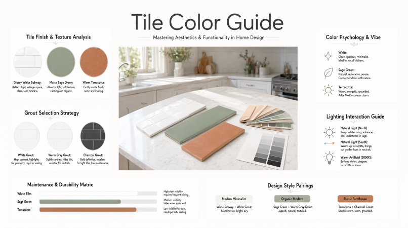
Picking the right tile color comes down to four things: the room itself, the light it gets, the finishes already locked in, and how much cleaning you’re willing to do. For most homes, light neutrals — white, cream, soft gray — are the safest bet on big surfaces. Green, blue, and terracotta shine when you want personality and have neutral tones carrying the rest of the space. Whatever direction you go, get a physical sample into the actual room before you commit to a full order.
This guide walks through choosing tile colors room by room, what grout works with white tile, what pairs well with terracotta floors, and whether you can recolor existing tile. Everything here is a design recommendation, not a building code. Where a technical point matters, I’ve tied it to manufacturer specs or industry standards.
How to Choose Tile Colors for Your Home
Work through these decisions in order — each one narrows the next.
Decide where the tile lives. Floors, shower walls, backsplashes, and accent areas all have different jobs. Floor tile needs to hide traffic and grit. A backsplash is mostly about looks and wiping down splatters.
Look at what’s already fixed. Countertops, cabinets, and flooring in connecting rooms cost real money to swap out. Pick tile that works with what’s already there, not the other way around.
Check the undertone. Whites and grays lean warm (yellow, cream) or cool (blue, green). Putting a cool white tile next to a warm cream countertop usually looks off, even if you can’t immediately say why.
Judge the light. North-facing rooms read cooler. Warm bulbs push everything yellow. Tile that looks crisp under showroom fluorescents can look flat or oddly tinted in your kitchen at 8 p.m.
Order samples and live with them. Look at them in morning light, evening light, and with your regular bulbs on. Never choose from a phone screen — monitors and photos distort both color and finish.
Choose grout at the same time as tile. Grout covers a meaningful chunk of any small-tile wall, so it shifts the whole look.
Color does change how bright or spacious a room feels, but it doesn’t change the room’s actual dimensions. Light colors reflect more light, which tends to make a small room feel airier. Dark colors pull things in and feel cozier or more dramatic. Neither is a guaranteed trick for making a room look “bigger” or “more luxurious.”
Popular Tile Colors and Where They Work
Rather than ranking colors by popularity (there’s no reliable, publicly verified ranking out there), here’s how each color family tends to behave. Treat the pairings as starting points.
| Tile color | Typical use | Colors that may complement it |
|---|---|---|
| White | Kitchen backsplashes, bathroom walls | Light gray, warm beige, charcoal |
| Beige or cream | Floors and walls | Warm white, wood tones, muted green |
| Gray | Modern floors and bathrooms | White, natural wood, one accent color |
| Terracotta | Floors, feature areas | Cream, olive, warm neutrals |
| Green | Backsplashes, accent walls | White, beige, natural wood |
| Blue | Bathrooms, kitchen accents | White, gray, soft warm neutrals |
| Black or charcoal | Floors, feature walls | White, light wood, brass or black fixtures |
White is flexible and bounces light around, but it shows every grout line and any dirt sitting in them. Beige and cream feel warmer and forgive minor soiling on floors. Gray fits contemporary spaces well, though very cool grays can feel chilly next to warm wood. Green and blue are easiest to live with when used on one surface — a backsplash or a single bathroom wall — with neutral surfaces holding the rest. Dark tile adds depth and hides some floor dirt, but it shows dust, water spots, and soap residue faster than you’d expect.
Kitchen Tile Color Ideas
In a kitchen, the backsplash is usually where you take a design swing. It’s a small area and far easier to redo than a floor.
Small kitchen with white cabinets: Keep the floor a quiet mid-tone — warm gray or light oak-look porcelain works well. A soft green or pale blue backsplash adds color without crowding the room, and a matching or slightly deeper grout keeps the wall calm.
Dark cabinetry (navy, charcoal, espresso): Light backsplash tile — white, cream, or pale gray — balances the weight of the cabinets. Dark grout would make the space feel heavier. Lighter grout keeps it open.
Natural wood cabinets: Warm whites, soft greens, and muted blues sit comfortably with wood. Avoid a backsplash whose undertone clashes with the wood’s — a stark cool white against orange-toned oak is a common mistake.
Busy countertop (veined quartz, granite): Choose a plain, quiet backsplash. Let one surface carry the pattern, not two.
For kitchen floors, a mid-tone, lightly textured tile hides crumbs and footprints better than pure white or pure black.
Bathroom Tile Color Ideas
Light neutral palette: White, cream, or soft gray walls with a slightly darker floor is a dependable approach that suits most fixtures.
Dark and dramatic: Deep green, navy, or charcoal tile can look striking, but expect to see water spots and soap film. Good lighting matters more here than anywhere else in the house.
Accent tile: Use a patterned or colored tile on one wall, a niche, or the floor, and keep the rest neutral.
Floor and wall coordination: Related shades — a gray floor with white walls — look intentional. Two unrelated mid-tones competing for attention rarely do.
One thing worth flagging: don’t choose a bathroom floor tile on color alone. Slip resistance matters on wet floors. The industry standard for ceramic tile, ANSI A137.1, uses a wet dynamic coefficient of friction (DCOF) value of 0.42 as the benchmark for tile intended for level interior areas that may get wet. Check the manufacturer’s rating for the exact tile you’re buying. A matte or textured finish is generally more slip resistant than high gloss, but verify by rating, not by look.
What Color Grout Should You Use With White Tile?
Light gray is the most forgiving choice for white tile. White gives the cleanest, most seamless look. Dark gray or charcoal gives the strongest pattern. The right answer depends on whether you want the tile pattern to stand out or disappear.
| Grout with white tile | Visual effect | Considerations |
|---|---|---|
| White | Low contrast, continuous surface | Shows discoloration and stains more readily; shade rarely matches exactly |
| Light gray | Subtle definition of each tile | Check undertone against the tile (warm vs. cool) |
| Dark gray or charcoal | Strong graphic grid | Makes every joint and any layout irregularity more visible |
| Warm beige | Softer, warmer feel | Works best when surrounding finishes are also warm |
A few practical points apply no matter which shade you pick:
Contrast shows the layout. Dark grout against white tile highlights the pattern, including uneven spacing or cut tiles. Low contrast hides small layout flaws.
Undertone matters. White tile is often not pure white. Hold the grout color chart against the actual tile before deciding.
Maintenance isn’t one-size-fits-all. Lighter grout shows stains sooner in wet areas and on floors. Darker grout can hide soiling but may show soap film, efflorescence, or fading. No shade is the easiest in every situation.
Grout type affects stain resistance. Cementitious grout is porous and generally needs sealing, which helps protect color and makes cleaning easier. Epoxy grout is more stain resistant, but follow the manufacturer’s directions for both products.
Use the manufacturer’s color chart as a starting point. Printed and on-screen colors vary, and cured grout can look lighter or darker than wet grout.
Here’s an example: A bathroom with white wall tile and light gray grout keeps the walls bright while giving each tile a faint outline. If the tile is a cool white, a slightly cool gray blends in. A warm gray may look slightly muddy against it.
What Colors Go With Terracotta Floor Tiles?
Warm whites, creams, sand, and beige are the safest partners for terracotta. Olive or muted green and natural wood make it feel layered rather than flat. Terracotta ranges from pale peach to deep brick red, so test the exact shade you’re working with.
Walls: Warm white, cream, sand, or soft plaster tones let the floor be the focus. Very bright, cool white can make terracotta look more orange.
Cabinets and furniture: Natural wood, rattan, and linen suit it. Olive, sage, or deep green cabinetry is a classic pairing.
Accents: Charcoal, black metal, or deep blue add contrast without competing.
Colors to approach carefully: Strongly saturated reds and oranges nearby can overwhelm the floor.
Here’s a room that works: terracotta floor, warm white walls, oak shelving, olive green ceramic accents, and black metal hardware. It’s a warm, grounded palette, and it holds together because the undertones stay consistent.
One more thing — terracotta and similar unglazed or lightly glazed clay tiles are often more porous than porcelain. Ask the manufacturer or supplier about sealing and cleaning, because a sealer can shift the color slightly.
How Lighting and Finish Change Tile Color
Gloss reflects light and can make color look brighter, but it also shows glare, fingerprints, and water marks.
Matte diffuses light, so color looks softer and more even.
Textured or handmade-look tile creates shade variation, so a large installation may look different from a small sample. Look at several tiles pulled from the box.
Patterned tile reads as a mix of colors from a distance. Hold a sample at eye level and then from across the room.
Always look at samples in daylight and under your evening lighting. Place them vertically for wall tile and flat for floor tile — light hits them differently in each position.
Common Tile Color Mistakes
- Choosing from a phone or monitor image
- Ignoring undertone clashes with countertops, cabinets, or existing flooring
- Picking grout last, or choosing it from a tiny chip
- Using high-gloss tile on a wet floor without checking slip ratings
- Selecting white grout for a floor or wet area without planning for upkeep
- Covering every surface in one strong color, leaving no place for the eye to rest
- Buying exactly the quantity needed — tile and dye lots vary, so keep a few spares from the same batch
If you’re planning quantities, our guide on how to calculate square footage covers measuring rooms and walls. For floors, the LVP flooring guide is a useful comparison if you’re weighing tile against other hard surfaces.
Frequently Asked Questions
Which color tile is best for a house? There’s no single best color. Light neutrals — white, cream, soft gray — are versatile and work with many styles. Mid-tone warm or gray floors are practical for high traffic. Choose by room, lighting, existing finishes, and how much maintenance you’ll tolerate.
What is the most popular tile color? White and neutral tones are widely used, but no current, verified ranking is publicly available. Treat any “number one” claim with caution. Popularity doesn’t mean suitability for your room.
What color grout should you use with white tile? Light gray is a forgiving, subtle choice. White gives a seamless look but needs more upkeep to stay clean. Dark gray or charcoal creates a bold grid. Warm beige suits warm interiors.
What colors go with terracotta floor tiles? Cream, warm white, sand, olive green, natural wood, and charcoal accents are common pairings. Match undertones and test with samples.
Can you change the color of existing tile? Yes, in some situations — but it’s a coating, not ordinary wall paint. Home Depot’s guidance says painting tile properly requires special epoxy paints or tile paints, and latex paint isn’t recommended. Rust-Oleum’s Tub and Tile kit uses a two-part epoxy acrylic for ceramic and porcelain, but the manufacturer says not to use it in constantly high-humidity environments like shower stalls. Surface cleaning and preparation are critical, and floors wear coatings faster than walls. If the tile is cracked, loose, or in a constantly wet shower, replacement or professional refinishing is usually the better route. Always follow the specific product’s instructions. homedepot homedepot-static
How do tile colors affect the appearance of a room? Light colors usually make a room feel brighter and more open. Dark colors usually feel cozier or more dramatic. The effect depends on lighting, finish, and surrounding colors — and it doesn’t change the room’s actual size.
Conclusion
Start with the room’s fixed finishes and lighting. Choose a tile color you can live with for years, then pick grout while the tile sample is still in your hand. Use light gray or matching grout with white tile for a calm result, dark grout for a graphic one, and warm neutrals with olive tones for terracotta. Before you commit, view full-size samples in your own room at different times of day.